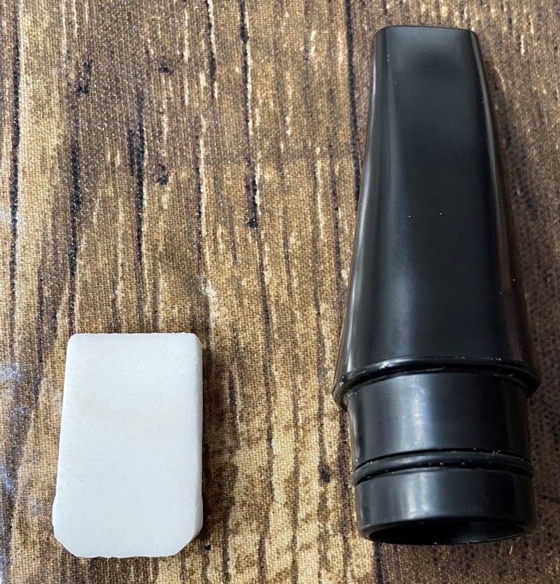
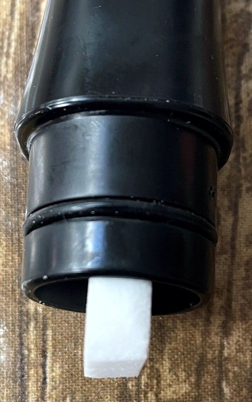
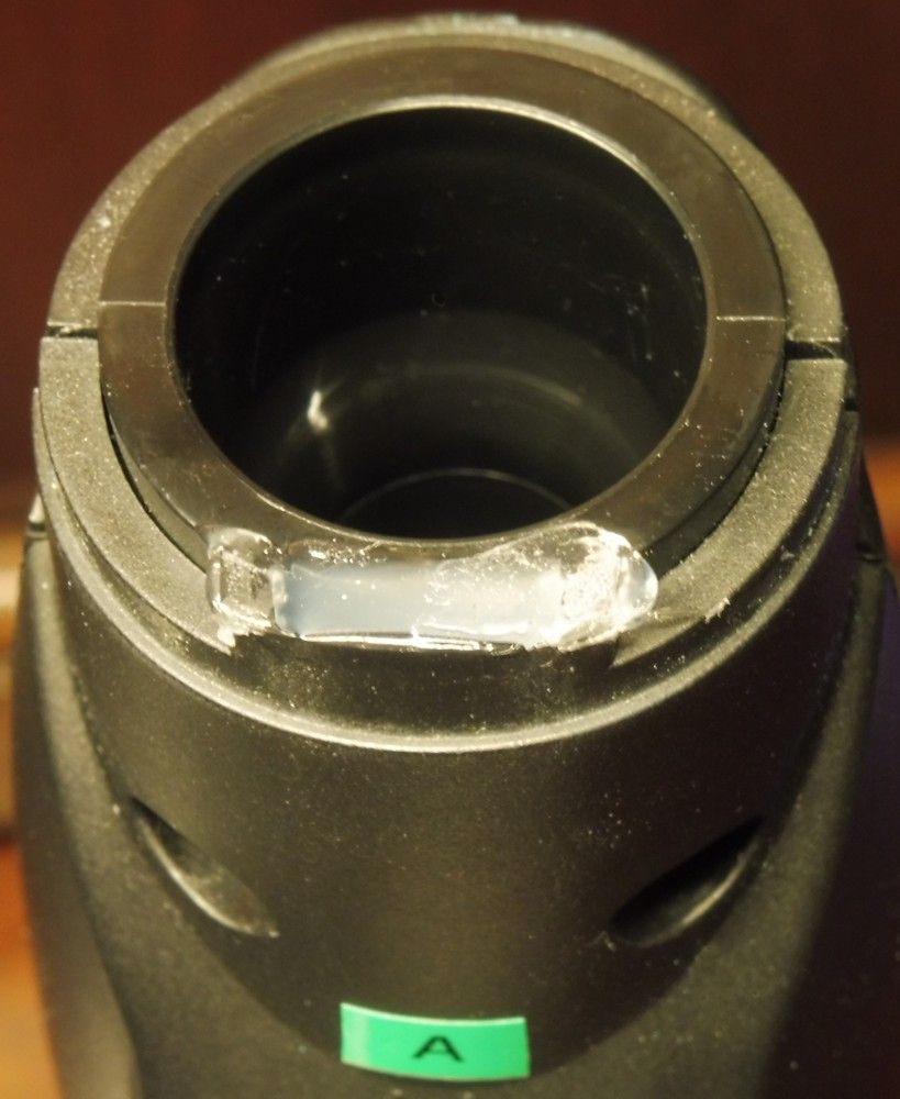
I have been working for several weeks now with some samples of a porous, hydrophilic material sent to me by flutemaker Edward Kort. They are custom cut from a 1/4" thick sheet with 10 micron pores supplied by Scientific Commodities (Cat #BB2062-10BL) that can be found on this page: https://scicominc.com/porous-plastics/porous-sheets/. Photos are shown in the earlier message in this thread.
My experience so far has be very positive. The material is easy to insert and remove from the standard Sylphyo mouthpiece. It does not cause a noticeable change in playing characteristics. The insert absorbs a substantial amount of moisture holds it, and dries out when removed (I typically dry it overnight).
The inside of my Sylphyo has gone from “large moisture droplets on the inside walls of the Sylphyo which coalesce and drip out the bottom” without the hydrophilic inserts to “light dew / haze on the inside walls” with the insert.
I am still on the road so can’t do a more detailed study (like weighing the insert before-and-after to determine the amount of moisture absorbed).
One concern is how oil (e.g. from handling the insert with fingers) might affect the long-term performance of the insert. There is apparently no remedy for hydrophilic material that gets clogged with oil. I am hoping that with reasonably careful handling (by the edges and just the area at the distal end of the insert), an insert might last a year or more. Edward Kort’s philosophy is (personal email) “make a pile and replace as necessary. It’s easy to check the condition of an insert: hold it to your lips and blow. If you can’t move any air, trash the insert.”
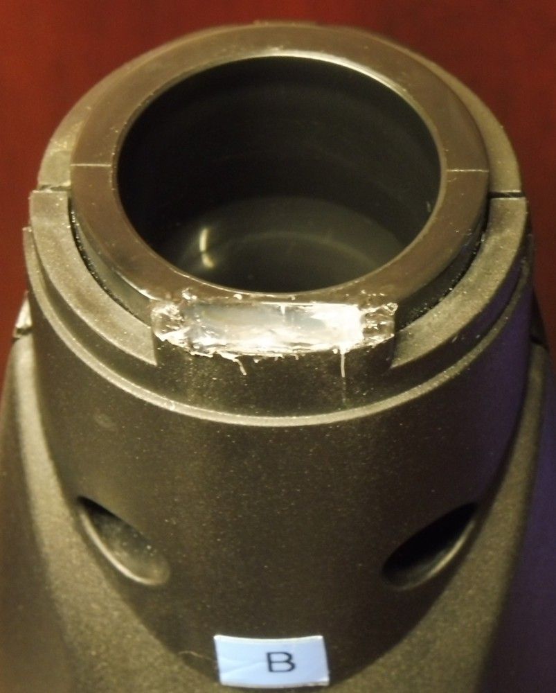
I was also concerned about possible shedding of fibers. Edward Kort’s feeling is that “I’ve never seen any fiber shedding; this would be a very bad characteristic in an industrial filter material. That said, the cut edges are feathery – probably due to the nature of the pore structure. With my NAF application (with the insert in the bird), I want the flue-exit end to be very smooth. I accomplish this by masking the surface of the plastic and apply CA glue just to the end. This end can then be smoothed and shaped. Works great, but it is an effort to implement. For the Sylphyo application, I don’t see any reason to seal the ends.”
He has also tried several variations:
I use two formulations of the plastic: the 10-micron pore style that I sent you, and a 30 micron pore size. The 30-micron product is much harder than the 10. It is not spongy at all and seems a bit more durable. However, it must be sawed rather than cut, and it contracts a bit when wet. This requires me to glue the insert into the bird channel, whereas the 10-micron product can just be press fit.
When I get back home (4 months on the road so far – great experience and somewhat exhausting. Just did a concert last night …) I hope to delve more into these inserts …
